The world needs a splash of colour
Life in General 26th August 2025
The below graph shows the distribution of different colours across different photos and objects from 1800 to 2020 from the Science Museum Group.
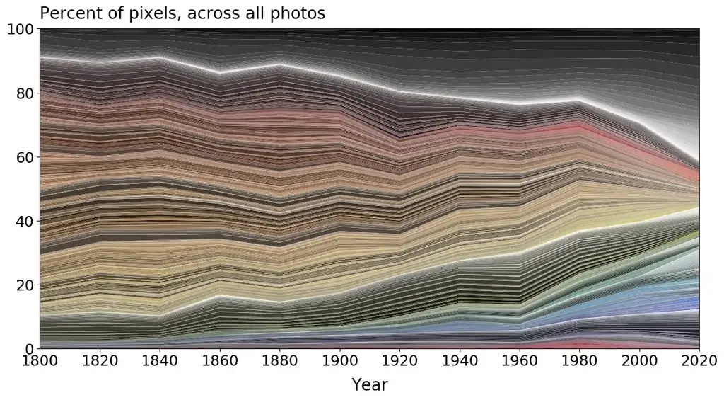
As you can see, there’s a clear pattern: less reds, oranges, yellows and greens, and more greys, whites and blacks. There’s also slightly more blue, but that is far less than the amount of grey!
It’s something I’ve noticed a lot, especially when it comes to the colours of cars, buildings, clothes, interior design and brands.
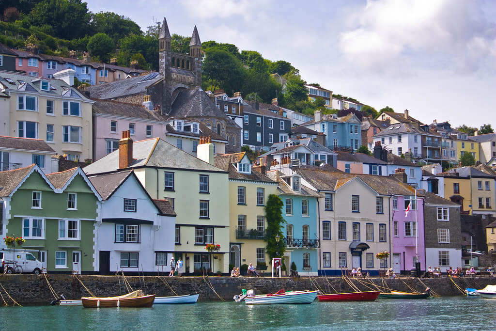
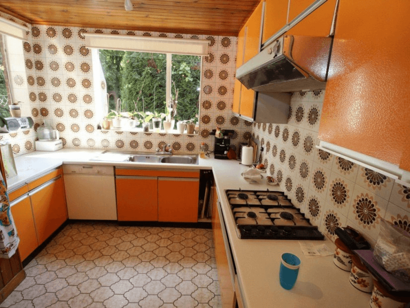
If you look back to those things a few decades ago, you’ll usually find that they had more colour to them than they do now. Orange wallpaper from the 70s, the bright clothes of the 60s, and centuries-old houses painted in bright pastel pinks, yellows and blues.
I’m not saying people don’t wear colourful clothes or have brightly-coloured kitchens anymore. What I am saying is that it’s less common, and it’s no longer the norm.
There’s plenty of evidence suggesting colourful environments benefit people more than black, grey and white ones. A study conducted in 2012 found that workers working in colourful workplaces felt better than those that didn’t.1 Whereas a US government report into hospital design claims hospitals painted in warm colours, such as orange, increased morale amongst patients and staff 2.
Our buildings, offices and homes don’t have to be a blend of black, white and grey. They can be bright, colourful, professional and functional. (Although there is a balance to be struck of course!)
So let’s start making life a bit more colourful.
- https://www.academia.edu/13648959/%C3%96zt%C3%BCrk_E_Y%C4%B1lmazer_S_and_Ural_S_E_2012_The_Effects_of_Achromatic_and_Chromatic_Color_Schemes_on_Participants_Task_Performance_in_and_Appraisals_of_an_Office_Environment_Color_Research_and_Application_37_5_359_366#:~:text=findings%20show%20that%20chroma%20significantly,the%20achromatic%20and%20chromatic%20schemes ↩︎
- https://www.gao.gov/assets/hehs-98-32.pdf ↩︎